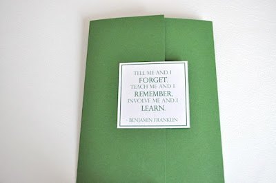
My original idea was to try to replicate the building's columns and frame the invitation with them. Unfortunately, the columns were hard to match, so I needed a plan B. I had done a little research on the school and was able to find an image of the building. Using the actual black and white photo in the design wasn't really going to work, but I had another idea. I decided to turn the image into a sketch and use it in the background of the invitation.
This is how they look:
I am still finishing up the order. I need to print the return address on the response card envelopes and package them all up. I may add more photos later when they are all finished.
Have a great weekend!!
Linking Up To:


Those look great, Jenn! I can't imagine how long it must take to do all that cutting, folding, pasting, etc. I like the mix of fonts. :)
ReplyDeleteThanks for joining my Weekend Bloggy Reading party. :) Have fun finding some new reads, and I hope you'll visit Serenity Now again soon! :)
These look so great, I love the Saying!! It is so How I learn!! Fantastic job!! Hugs Anne
ReplyDeleteSo Adorable!! Great job...love the front quote and the color!!!!
ReplyDeleteThose are really pretty!! Love the quote! Found you through Amanda's Weekend Bloggy party
ReplyDelete